Workcover QLD

Project: As a Senior Product Designer in WorkCover insurance, I focused on innovating user-centric solutions for work-related injuries and illnesses. My role involved developing and refining various products and management software to enhance user experience, streamline processes, and provide efficient solutions for both employers and employees, blending creative problem-solving with technical expertise in the insurance sector.

Role: Product Design, UX UI Design, Design system, User research, Product strategy

Year: 2023

01 . Claims management softweare
The project aimed to address several key issues affecting user experience, efficiency, and overall functionality of the software. By systematically tackling problems in various aspects of the software — Claims Table View, Claims Profile View, Work Items/Tasks/Actions, Communications, Automation, Navigation, and the Dashboard view — I aimed to create a more intuitive, efficient, and user-friendly platform.
Problems Identified
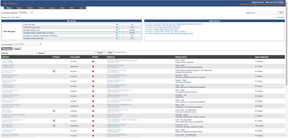
The present interface is antiquated, featuring a dated design with suboptimal user experience and user interface elements.
Communications:
Poor organization and categorization in the communications section.
Automation:
Repetitive tasks due to lack of automation.
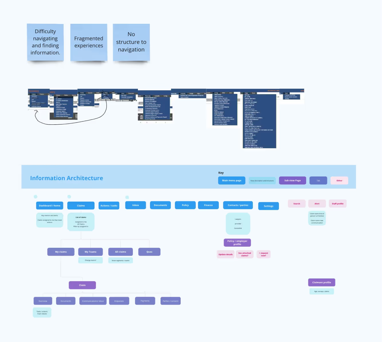
Navigation:
Poor organization and categorization in the communications section.
Dashboard:
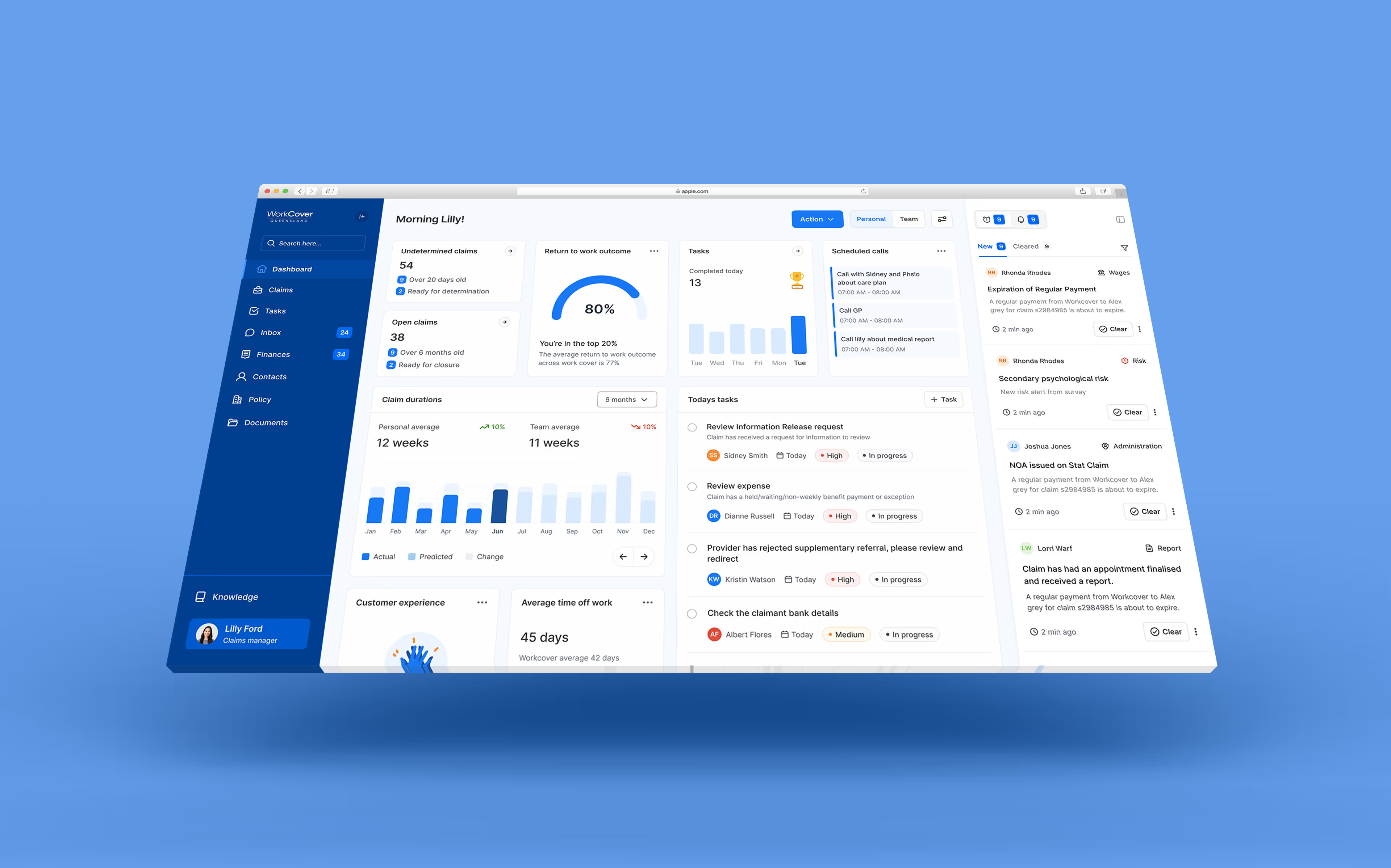
Non-optimized dashboard view impacting workflow efficiency.
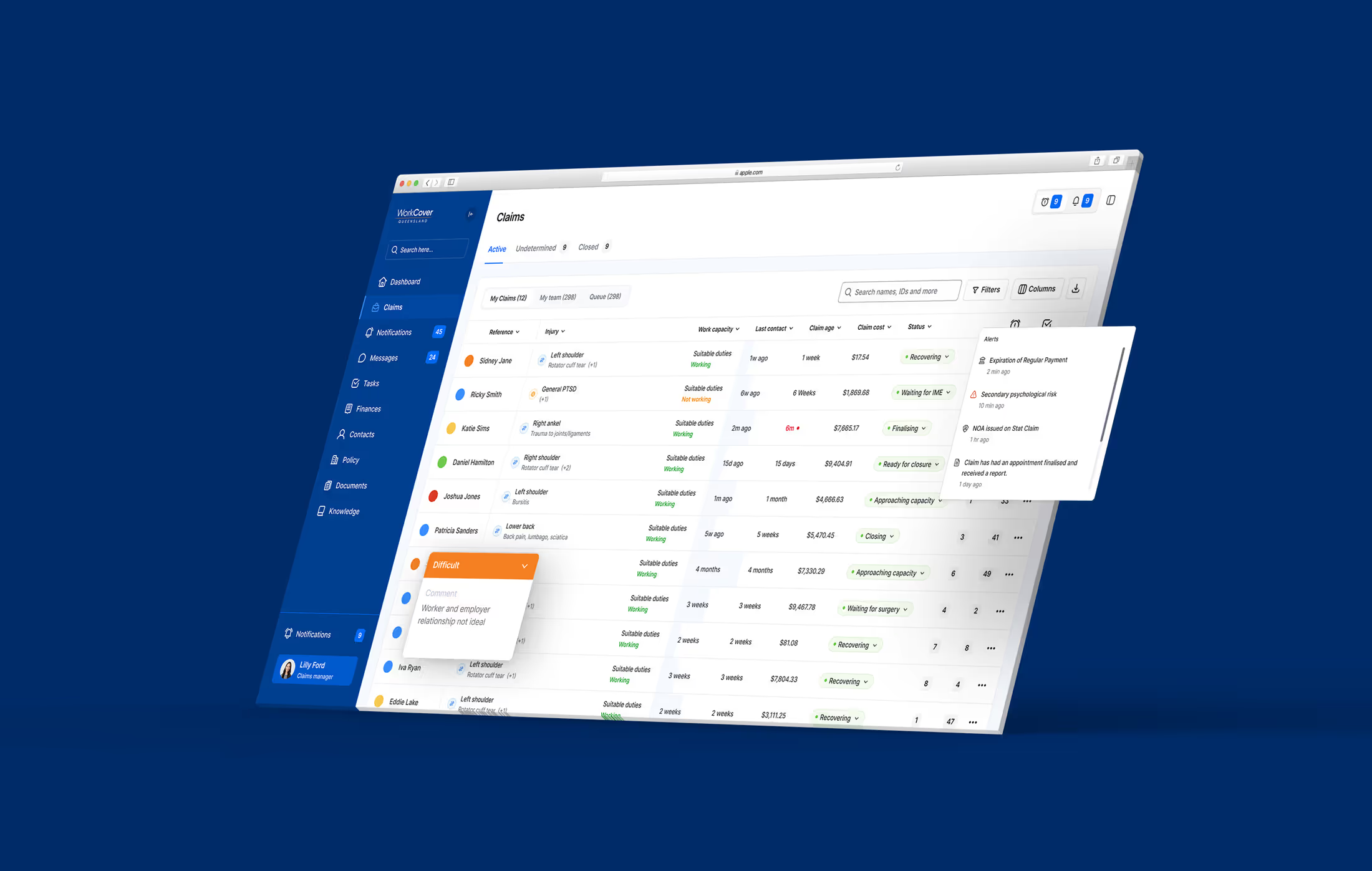
Claims Table View:
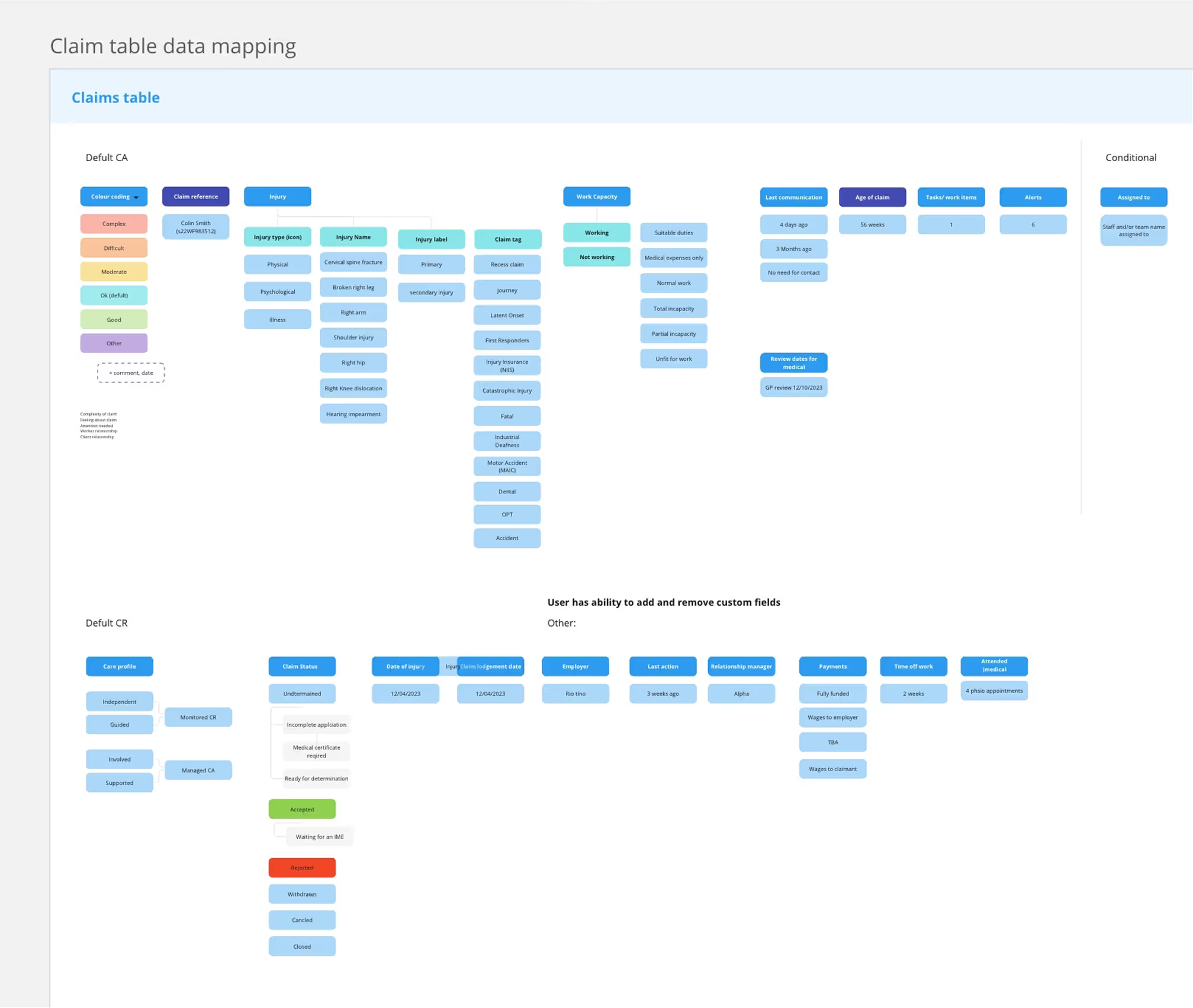
Lacked insightful data, and had limited sorting and filtering capabilities.
Claims Profile View:
Missing relevant medical information, navigation issues, and disjointed user experience.
Work Items/Tasks/Actions:
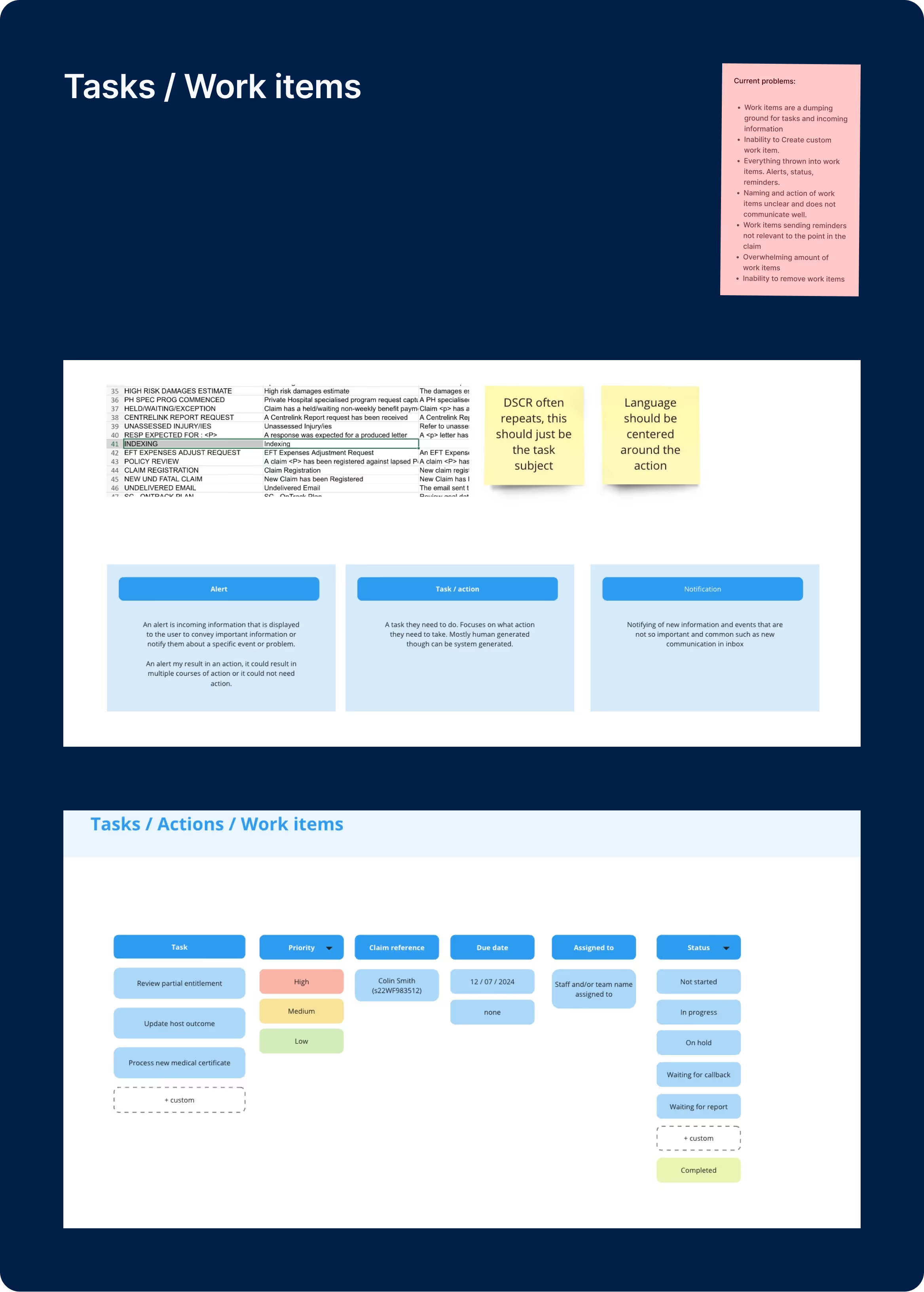
Confusing and overwhelming work items, lack of customization and clarity in task management.
Approach
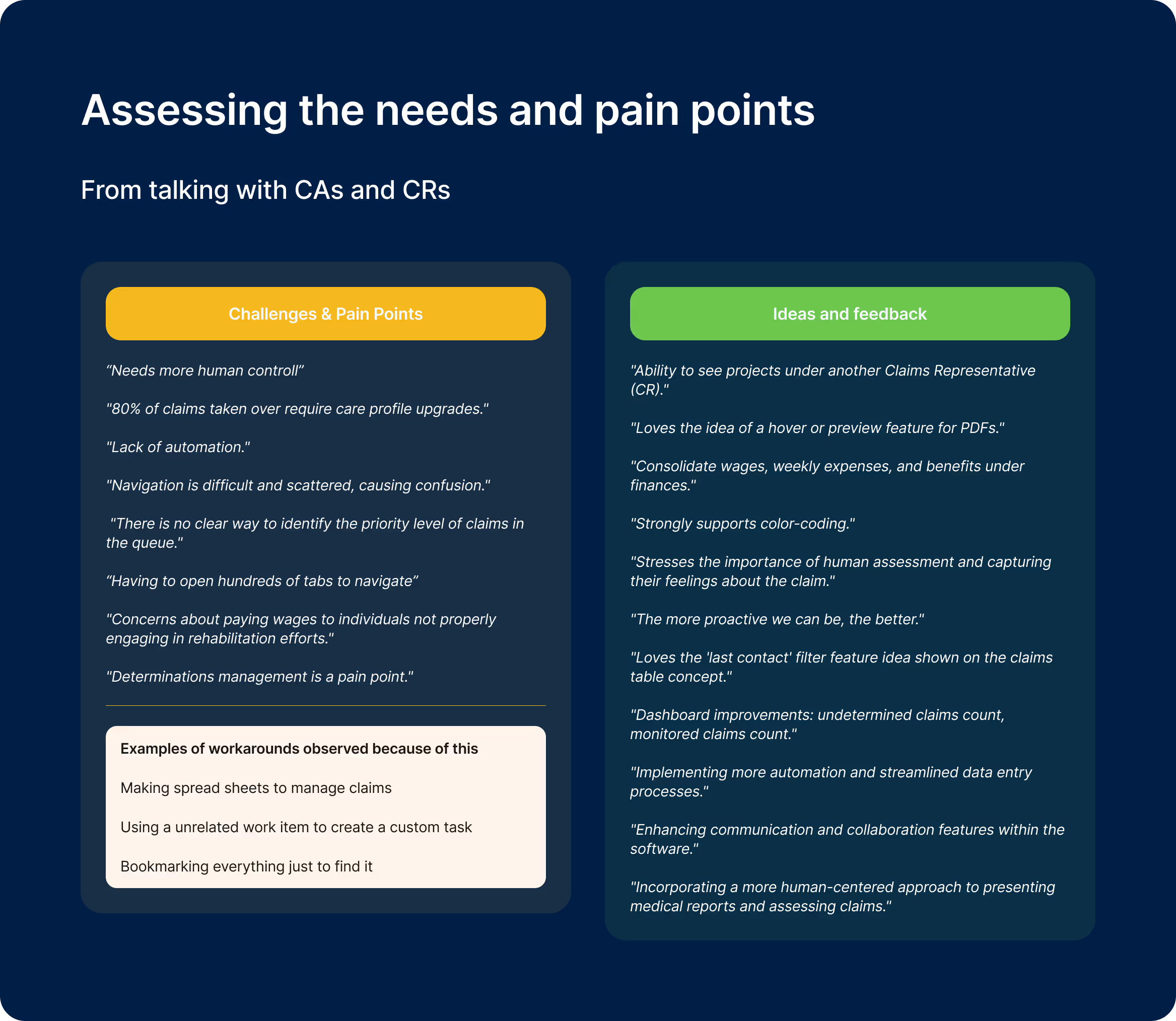
In the first phase, which focused on Needs Assessment and User Research, I conducted comprehensive user interviews and surveys to analyze common pain points and workflow inefficiencies. This allowed me to identify essential features and functionalities based on user feedback. During the second phase, Conceptualization and Design Workshops, I organized design sessions with business experts to address specific problems and propose solutions. Collaboration with stakeholders was key in defining the necessary data points and features for each software section, and I explored various visual and functional designs to enhance the user experience.
Dashboard
I developed two dashboard concepts for CA/CR and another for managers/team leaders. These designs are optimized to emphasize key metrics and data, enhancing workflow management. A modular approach was employed to allow user customization and ensure versatility.
Claims Table View
I Implemented dynamic data filterable points providing insightful information and added advanced sorting and filtering options.
Claims Profile View
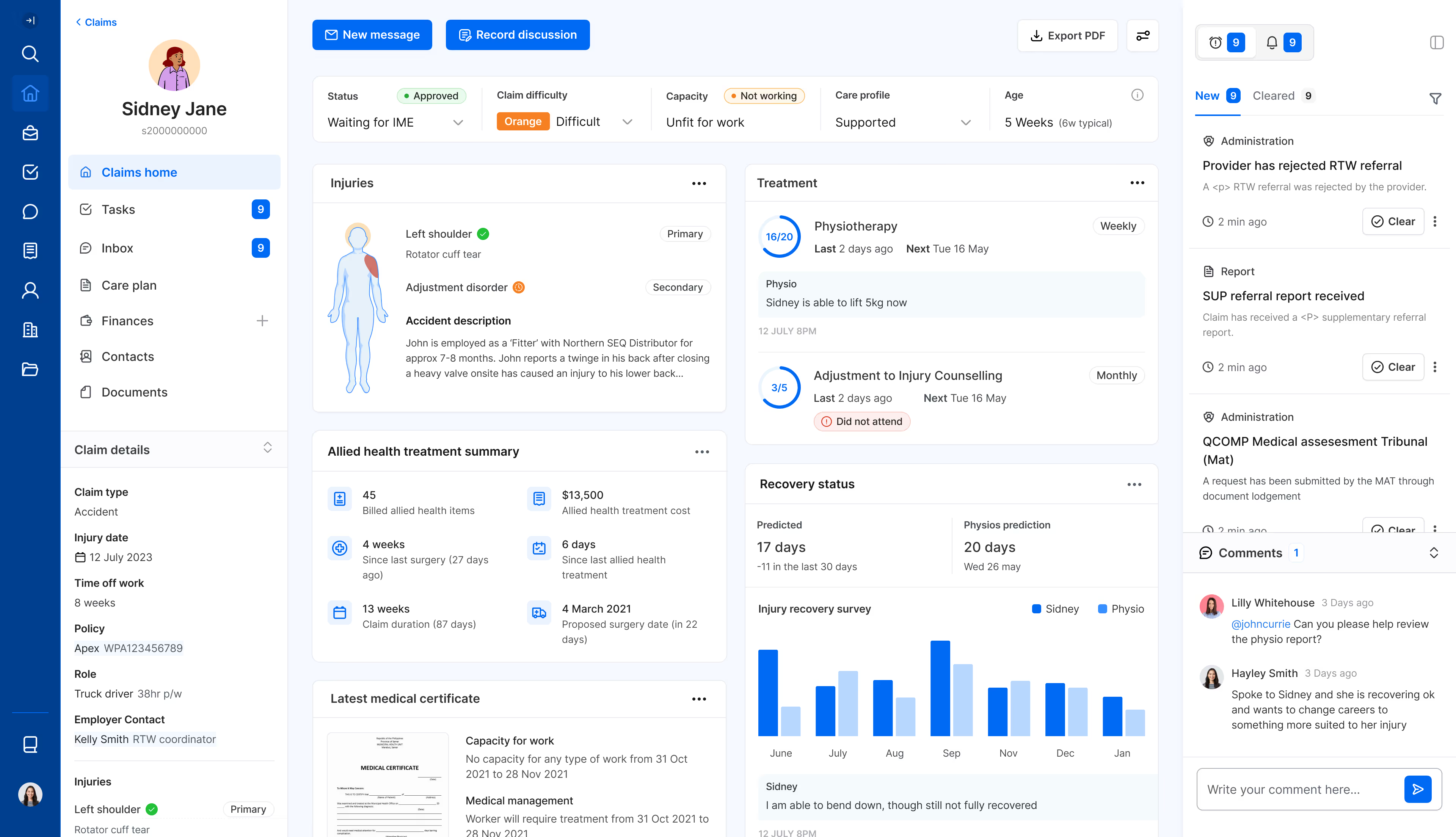
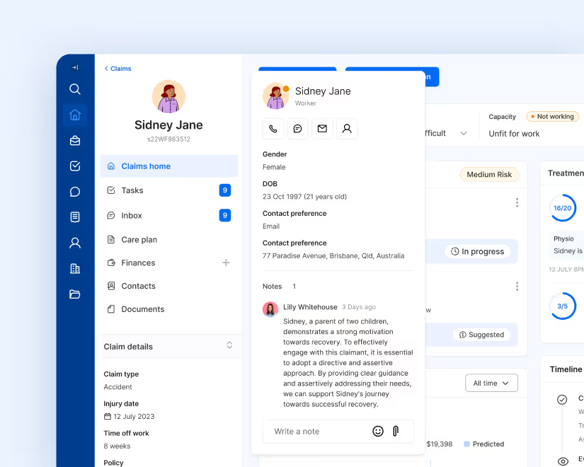
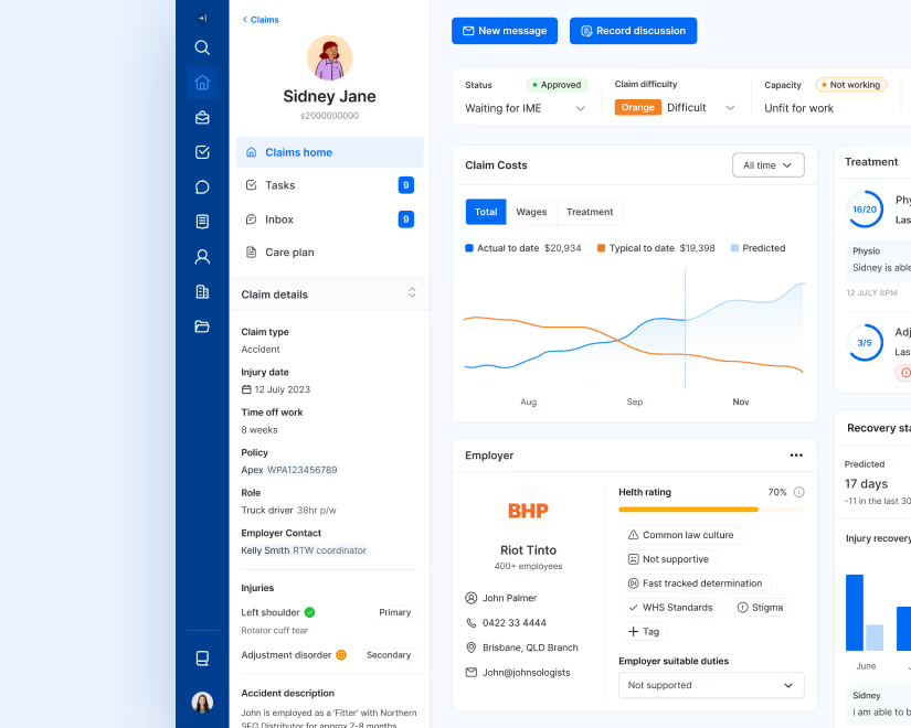
The claims profile view was designed in a way to be able to view and navigate a lot of detailed information about a claim in order for the user to effectively manage the claim and collaborate within their team. The dashboard takes a modular approach so the different user types can customise it to what is important for them.
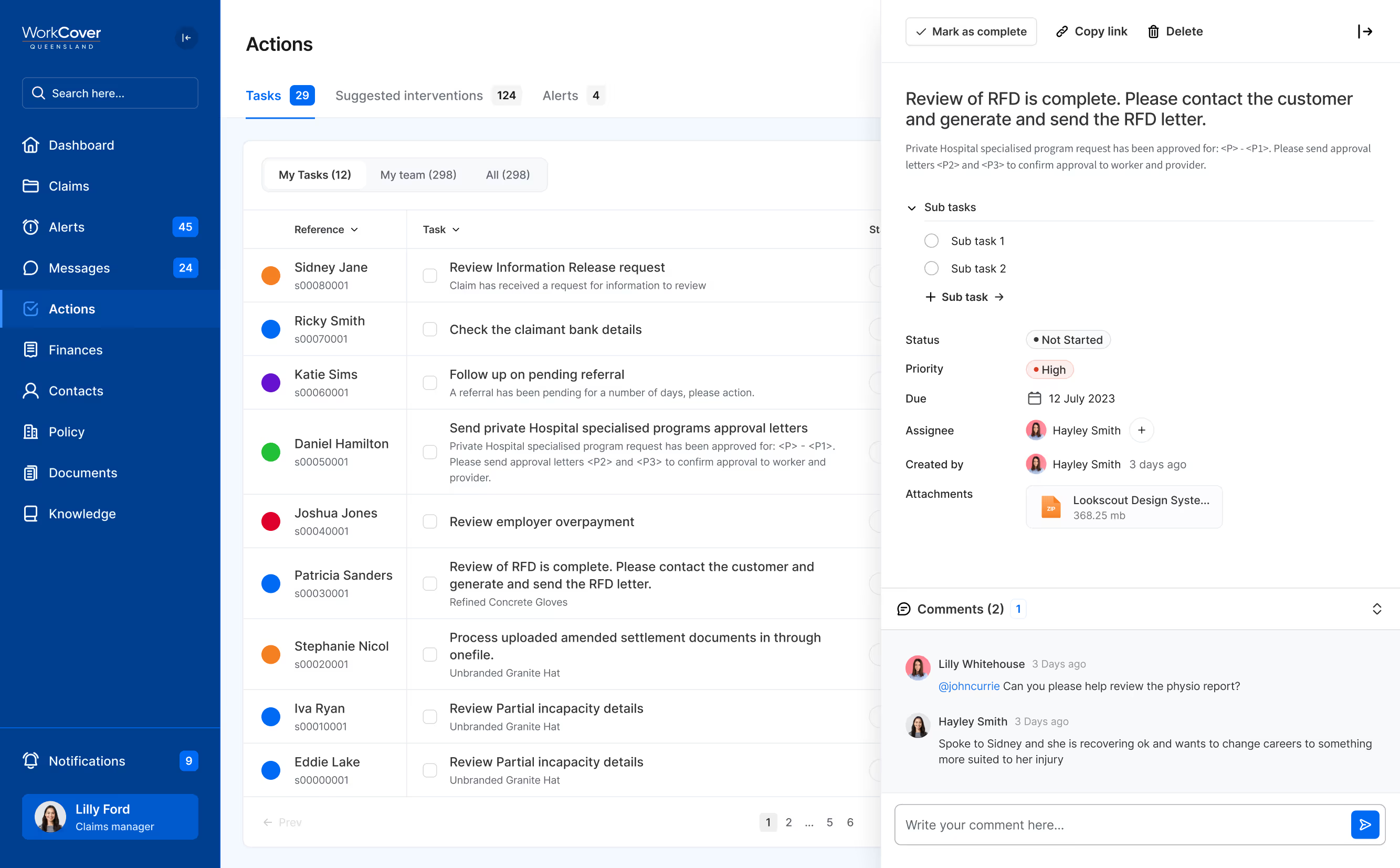
Actions and Tasks
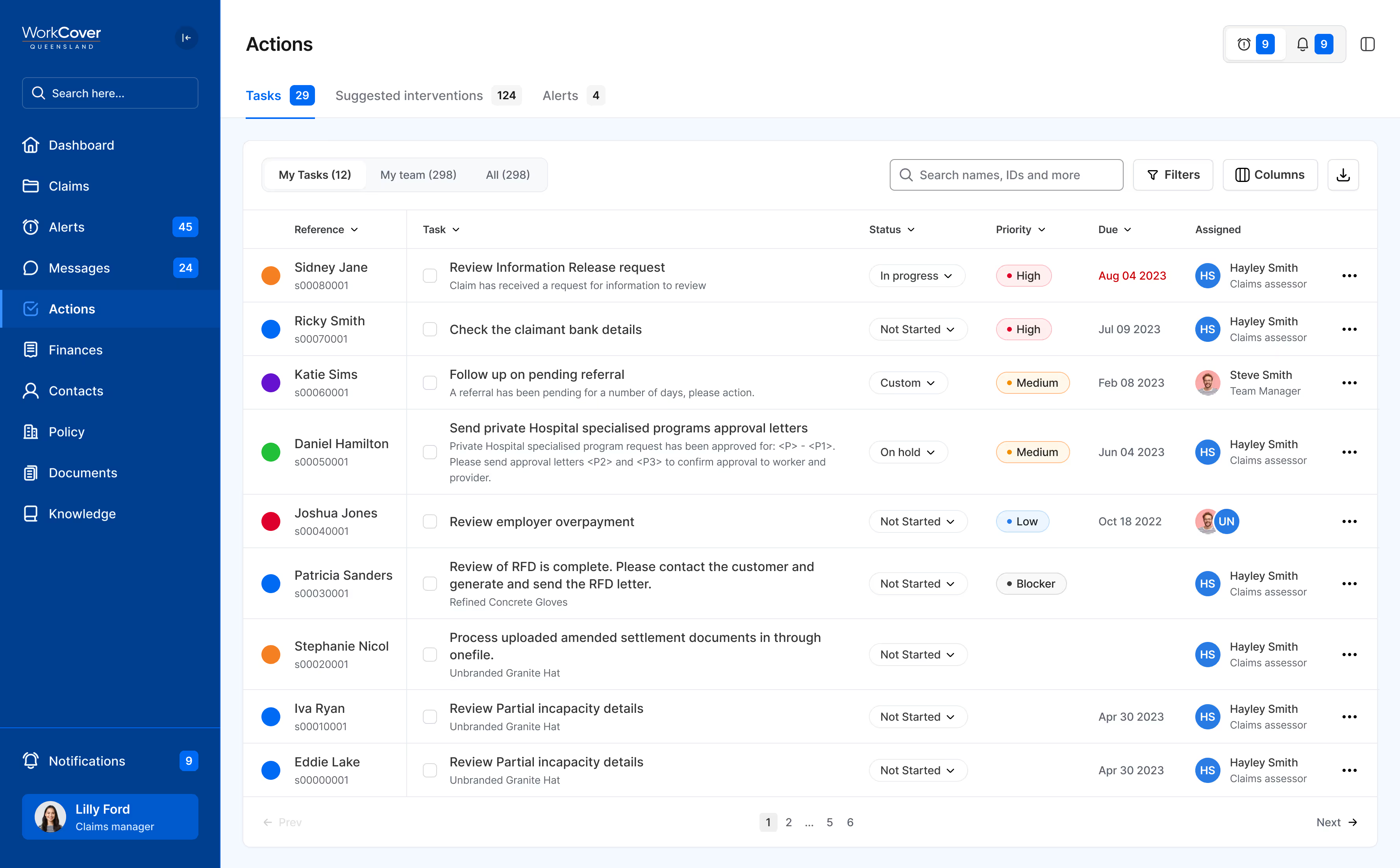
I streamlined work items to reduce clutter, introduced user-friendly, human-controlled statuses for better task management, and added customization features like priority toggles for a more personalized experience. Furthermore, I categorized work items into three groups for improved efficiency: Alerts, which provide crucial updates and notifications about events; Notifications, which inform users about internal updates and communications, different from alerts as they are system events; and Tasks/Actions/Workflows, focusing on actionable tasks to streamline workflows, whether they are human-generated or system-generated.
Navigation
Navigation was restructured with relevant information grouped for ease of use.
Result
By focusing on real user needs and continuously iterating based on feedback, the redesign significantly improves efficiency and usability of the software. Though the business has not yet implemented the designs into development, it received great feedback from users who were excited for the transformation.
02 . The signature experience design system
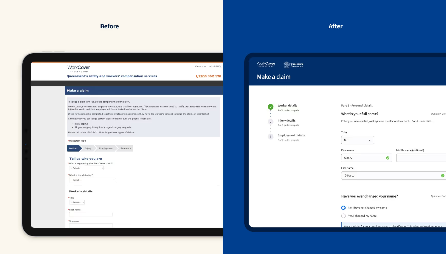
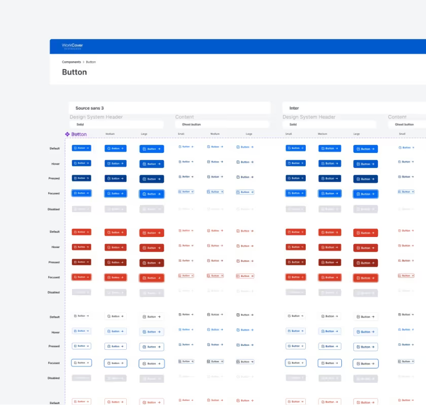
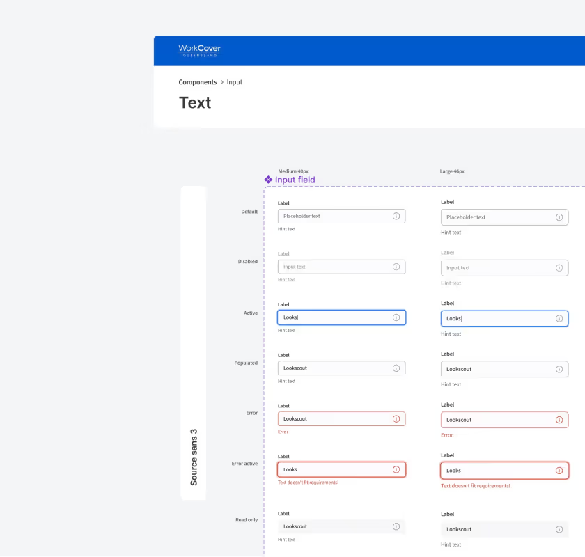
The journey began with the conceptualisation and design of the Workcover claims registration form and app. This initial phase was pivotal in establishing the aesthetic and functional essence of Workcover's new digital experience. I spearheaded the creation of a comprehensive design system. After conducting research I chose Lookscout as a base, which I customised to align with Workcover's unique style guidelines and accessibility requirements. During the design process, the system underwent meticulous refinement, a collaborative effort involving valuable inputs from the team. This collaborative approach ensured that our design system was not only aesthetically pleasing but also functionally robust to meet all the needs within the design team.
In the next phase, we integrated the refined design system into a React framework, focusing on developing essential components for the registration form. Utilizing Storybook, we created an interactive environment for testing and refining these components, ensuring they met our standards for both design and functionality. Currently, this phase serves as a stepping stone towards launching the digital registration form. The form, still in development, will be a key element in showcasing Workcover's enhanced digital experience. Once launched, it will embody our commitment to merging aesthetic appeal with practical utility, significantly improving the user journey within the Workcover digital ecosystem.
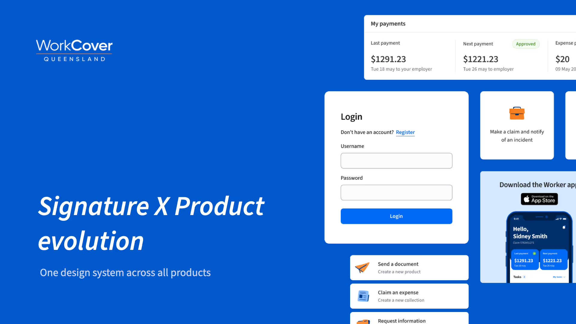
03. Product Evolution
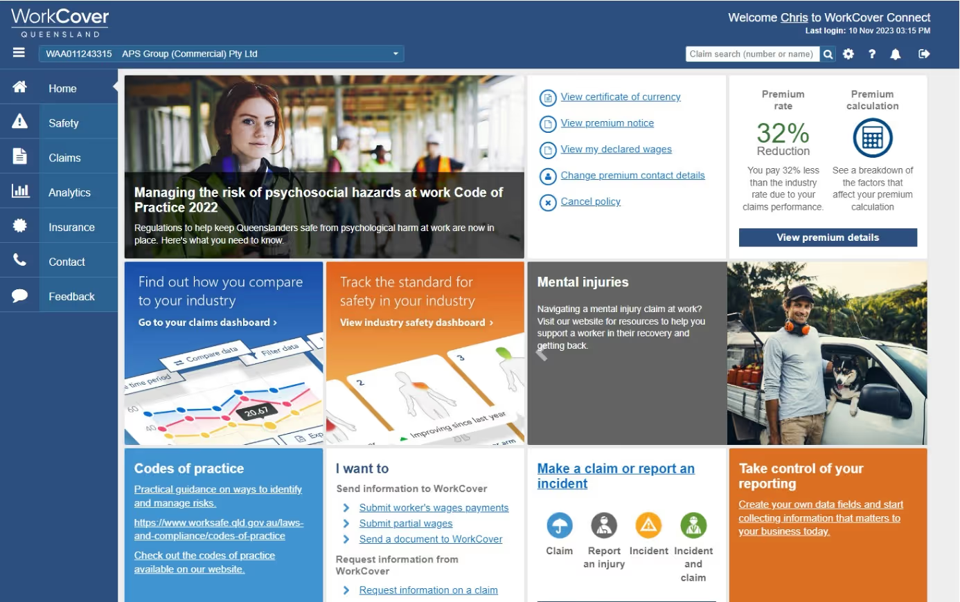
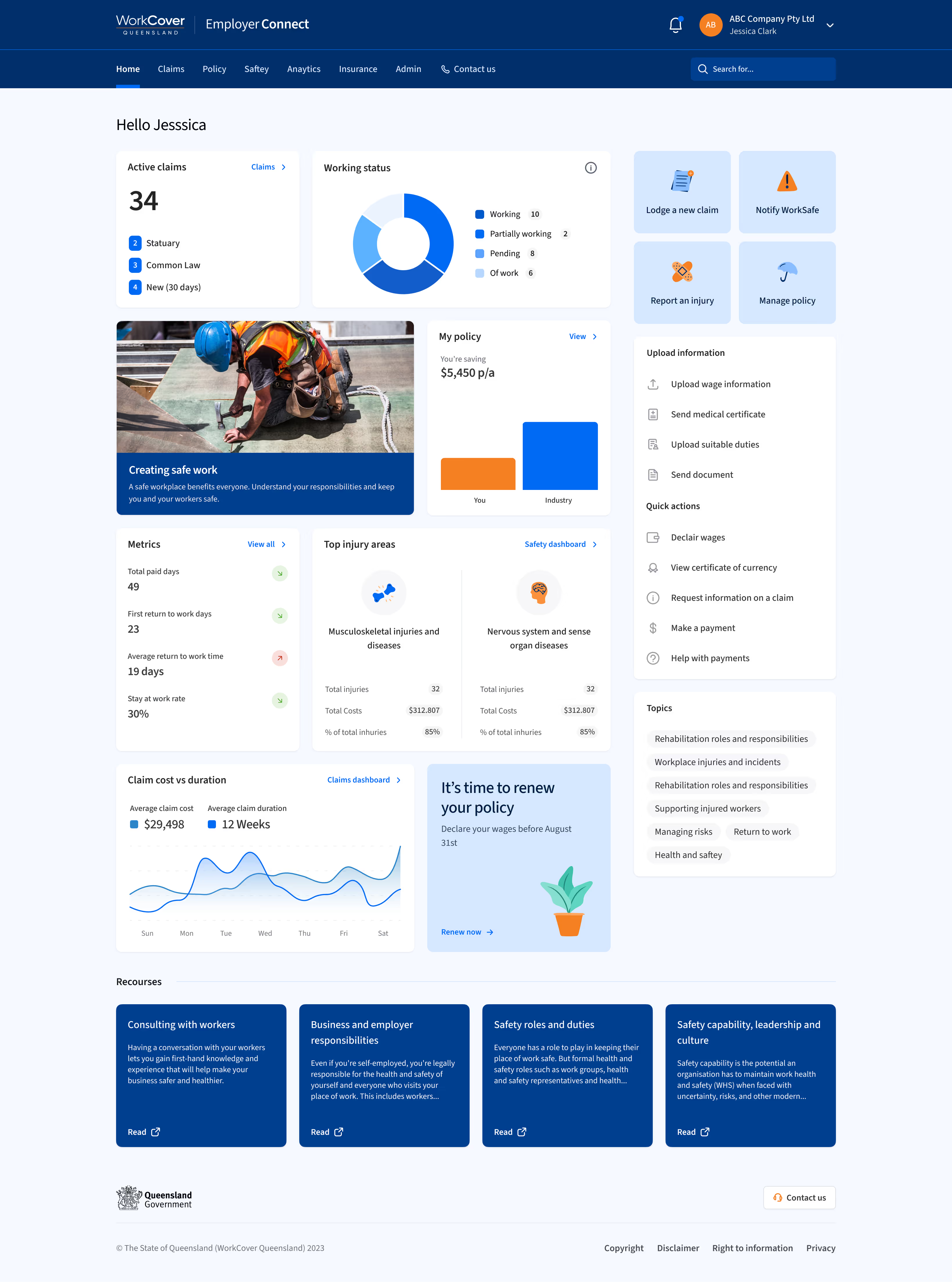
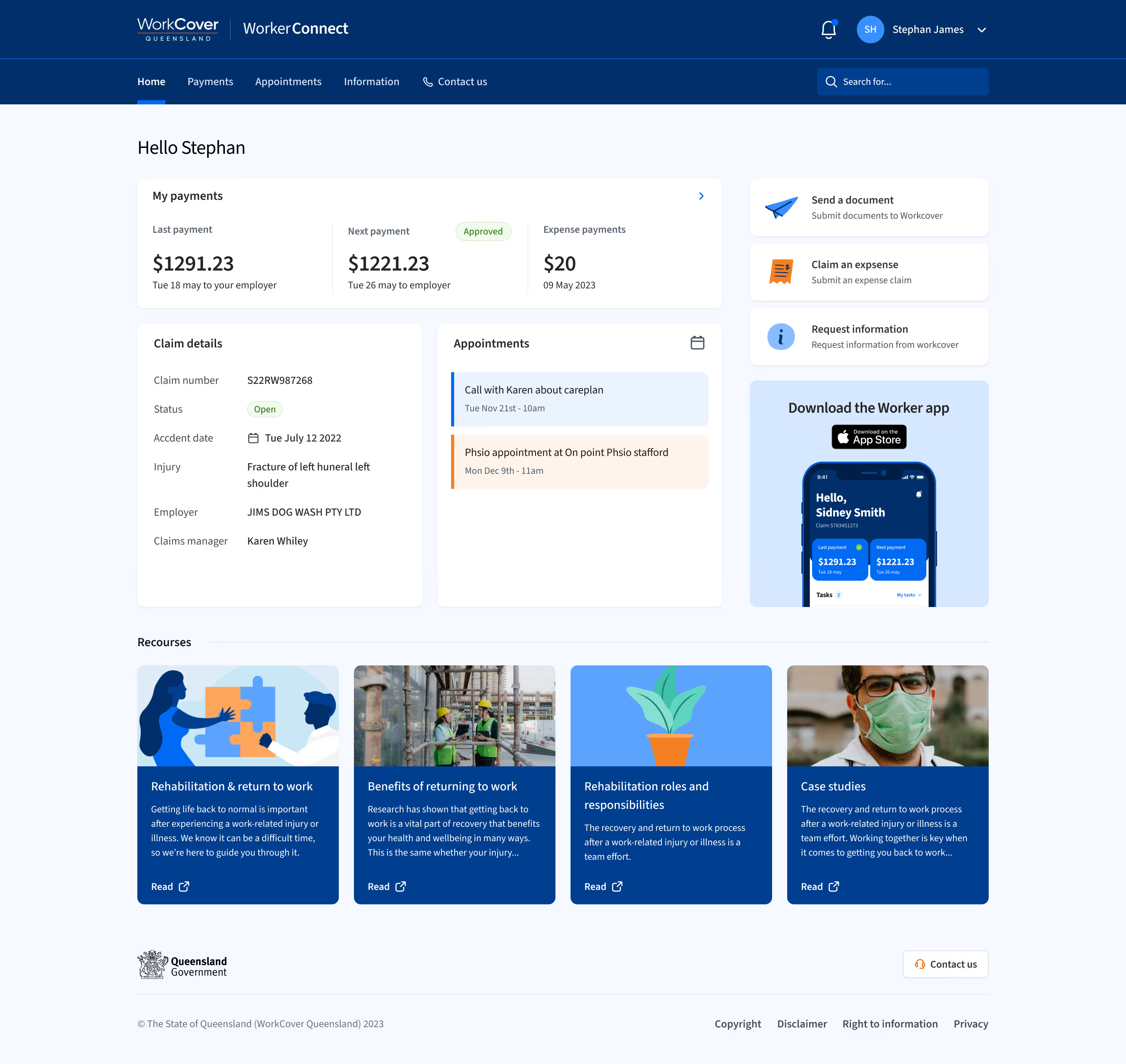
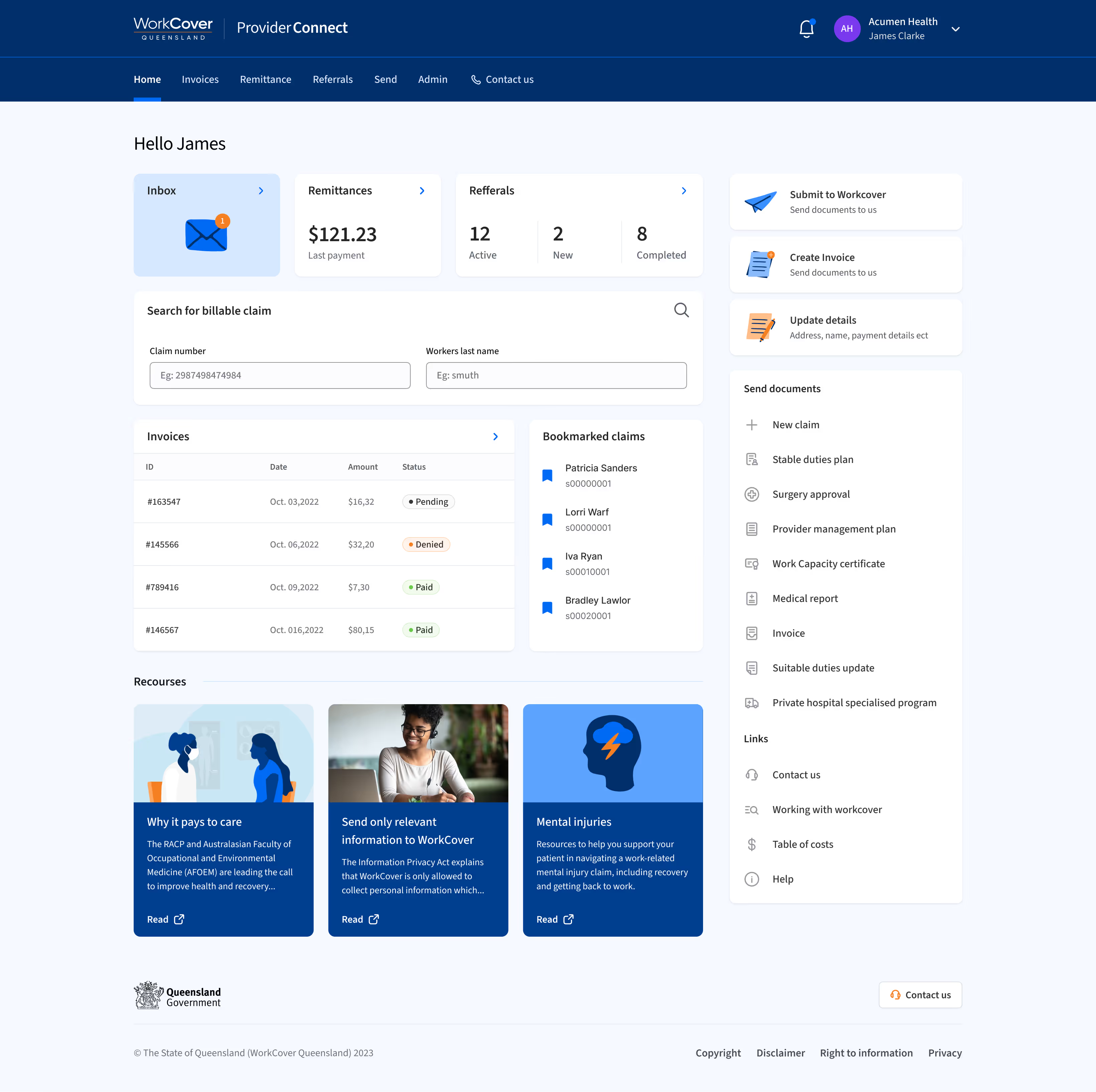
WorkCover faced a significant challenge with inconsistent identity and user experience across their products. Users were experiencing stress, frustration, and confusion due to disjointed user interfaces and outdated systems. This led to increased customer support needs and overall dissatisfaction. To address these challenges, I embarked on the Signature X evolution project. My aim was to implement a unified design system across all WorkCover products, ensuring a consistent digital identity and user experience. WorkCover's extensive range of products, catering to different user types, often led to ambiguity. To counter this, I streamlined the product names to directly reflect their purpose and target audience. 'Workcover Connect' was aptly renamed to 'Employer Connect', signifying its primary use for employers managing WorkCover insurance policies. Similarly, 'Worker Assist' was transformed into 'Worker Connect', clearly indicating its role in connecting workers with their WorkCover claims. The name 'Provider Connect' remained unchanged as it effectively conveyed its intended use for healthcare providers.
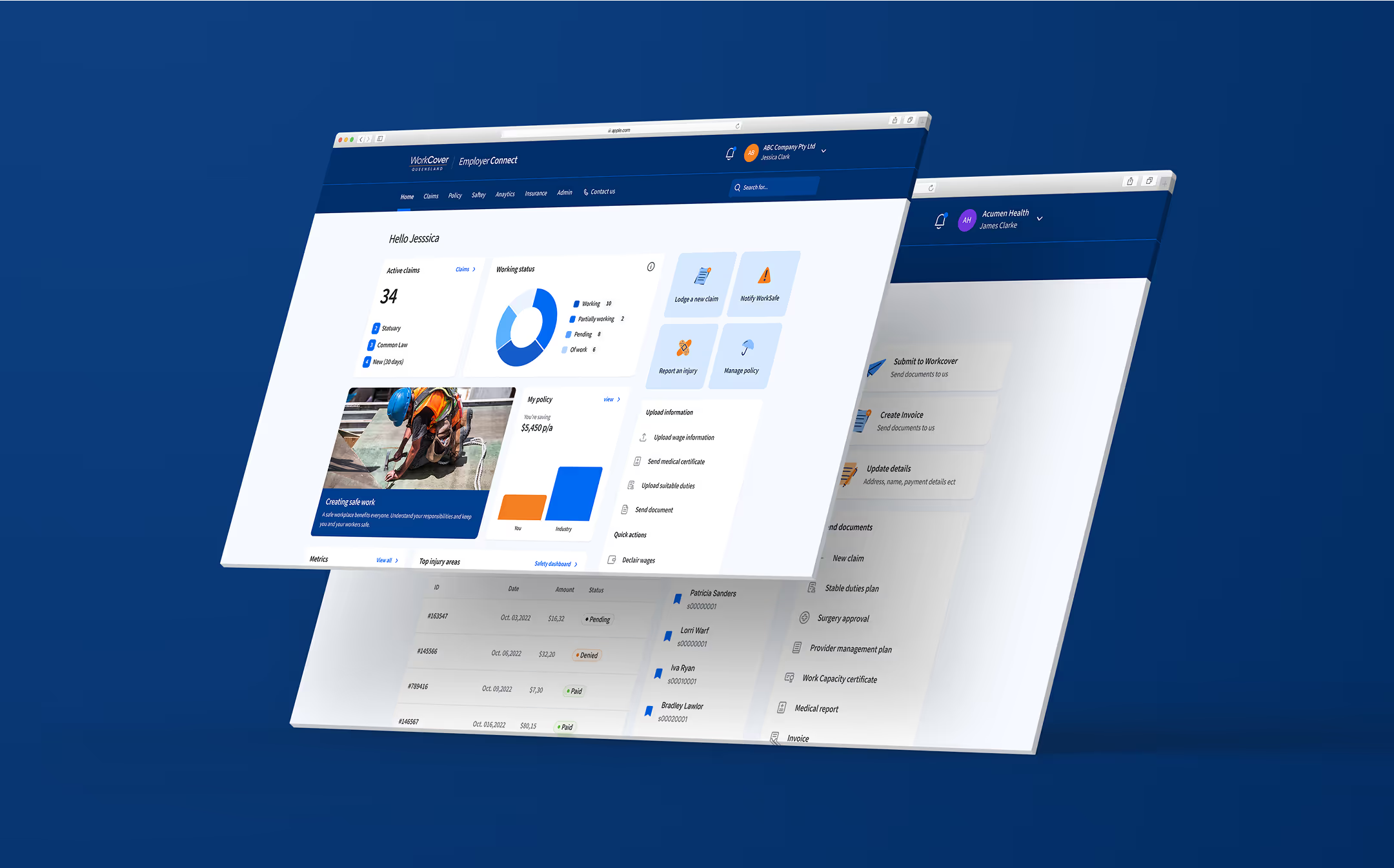
Employer Connect
Employer Connect is tailored for businesses managing WorkCover insurance policies. This portal streamlines the handling of policy claims and details, offering functionalities such as reporting incidents, lodging claims, and uploading or exporting information. The redesign of this portal under the Employer Connect name significantly enhances the clarity and efficiency for business users, making it simpler and more intuitive to manage their insurance-related tasks. Below you can see the current UX/UI vs my redesign.
Worker Connect
Worker Connect is a dedicated portal for individuals with WorkCover claims. It provides a transparent and accessible platform for workers to easily view and manage their claim-related details, including the visibility of claim information, tracking upcoming and past payments, and managing personal details and claim expenses. The transformation of Worker Connect under this new name and design greatly improves the user experience for workers, offering them a clearer, streamlined way to handle their claims. Below you can see the current UX/UI vs my redesign.
Provider Connect
Provider Connect remains the go-to portal for healthcare providers like Physiotherapists and Psychologists treating patients under WorkCover claims. It facilitates various administrative tasks such as submitting invoices for remittance, managing patient referrals, and handling documents. Its user-friendly interface and tailored functionalities enhance the efficiency of healthcare providers, enabling them to focus more on patient care while managing their administrative duties with ease.
04. Login and regisration
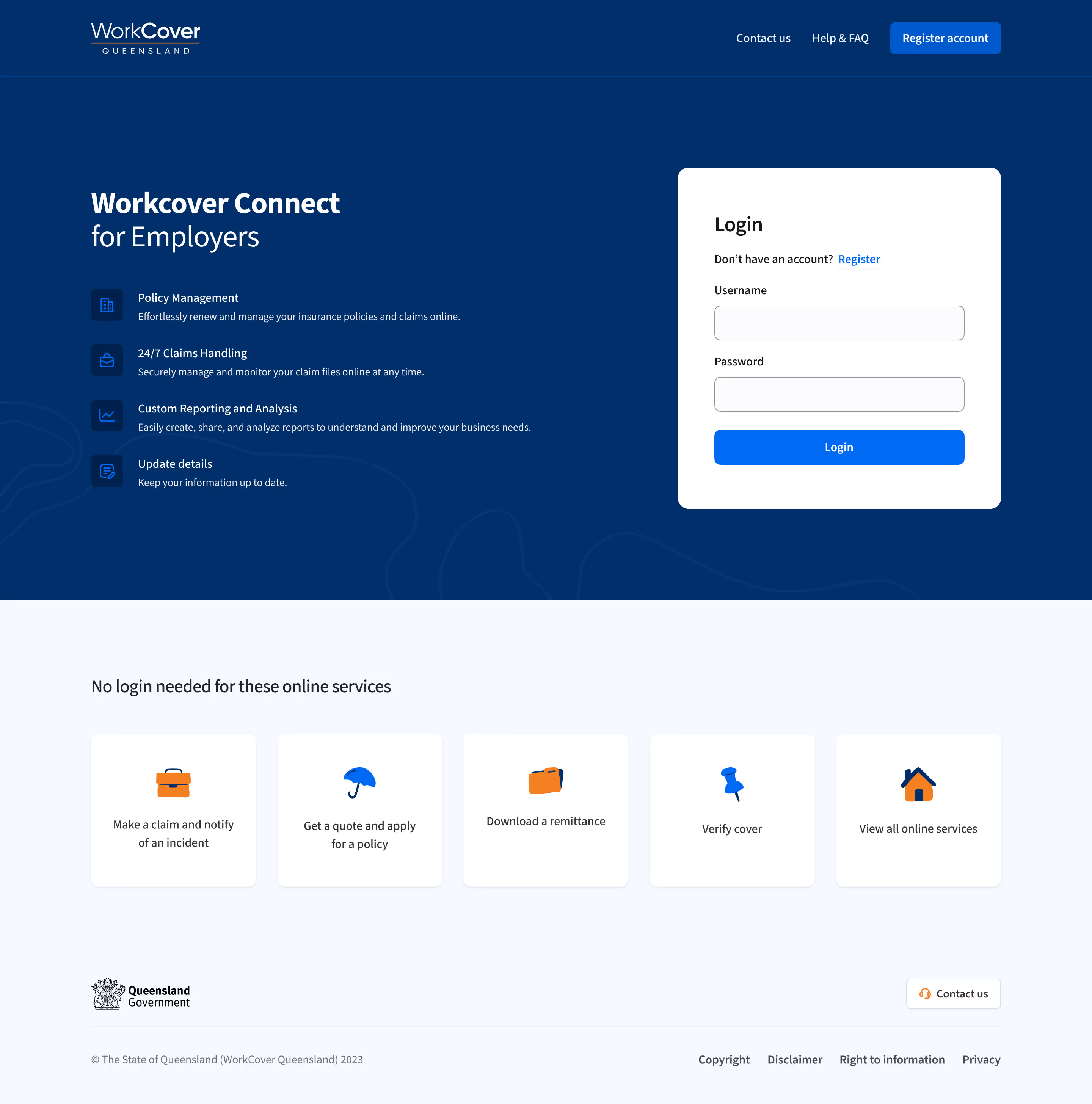
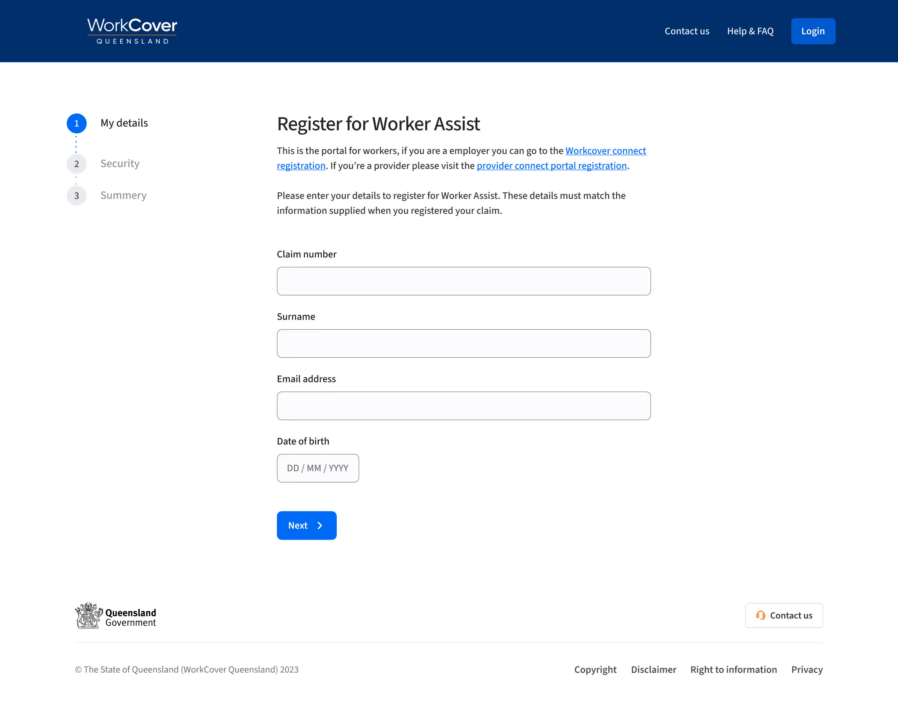
The SignatureX project at WorkCover included a significant enhancement of the login and registration interface across all its portals. The initiative was aptly dubbed "One login screen to rule them all," aiming to create a unified and seamless experience for users. By implementing the design system across the login pages and registration forms, we achieved an efficient and scalable solution. This approach meant that we only had to build the system once, allowing it to be reused as a template across various platforms, utilizing components already established in the design system. This strategy not only streamlined the development process but also significantly enhanced the user experience (UX). Addressing this major pain point for users resulted in a more consistent brand experience and a smoother journey through the user interface, marking a substantial improvement in the overall digital experience at WorkCover​